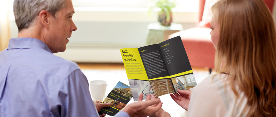
Brochures have always been a great way to promote a company’s products and services. They’re bright, bold, and impart a clear message about a company and brand. But of course, in order to be truly effective, they need to be done right. Here’s what you need to remember when you are creating a brochure for your company.
What it is
Before you begin, you should have a basic idea about what a brochure really is. Brochures come in different forms – there are single-page brochures and multi-page brochures, and they can also be bi-folded, tri-folded, or gate-folded. A brochure has an array of purposes – it can be used as a menu, it can serve as a catalog of your company’s products, and it can also serve as a basic sell sheet.
The brilliant aspect about a brochure is that, unlike a banner or poster which often just gets a cursory glance, a brochure is something that your audience can actually interact with. They hold it in their hands, they turn it over, they flip the pages – and this gives you a chance to really engage them.
What makes for a brilliant brochure
Know what it’s for
The first thing you have to determine is the brochure’s purpose. What is it for? One common error is to pack too much information into the brochure, making it look crammed and confusing. But if you have determined the brochure’s purpose first before designing it, then it will be easier to make it more concise – and effective. How will your brochure be distributed? Also, is it for promoting a particular product or service, or is it to inform or educate your customers? What would you like your audience to do once they have it? There needs to be a clear action which you want your audience to perform. Knowing the answers to all of these questions will help you come up with a more focused, logical, and organised brochure printing design.
What is your brochure’s format?
It’s also important to consider the format of your brochure. If you are planning to have a bi-folded brochure, you would want your audience to be ‘surprised’ once they open the cover page. Create an element of surprise, and you’ll have your audience turning the brochure over to see what else they can find.
The cover
The third most important aspect in effective brochure printing is the cover. People will judge your brochure by its cover, after all. Although you can settle for your company logo or a nice image on the cover, is it interesting enough for your audience? Perhaps you can think about a catchy phrase or headline, a question, or a call to action on your brochure’s cover. Remember this as well: the top part of your brochure will be the most noticeable, so pay particular attention to it.


